
The Property Manager’s Guide to ADA Signs
As a property manager, you want everyone who visits your property to feel comfortable, safe, and welcome. One way you can provide that inclusive feeling is by using ADA signs.
According to the CDC, 61 million Americans have a disability. This represents nearly one in four people. Yet, many commercial properties don’t consider this group when laying out their property.
You have the power to make your business more accessible. Along with adding ramps and wheelchair-accessible spaces, you can also update your signage to make it easier for hearing and vision impaired visitors to navigate your campus.
Here are seven ways you can use ADA signs to make your property easier for everyone to navigate.
1. Avoid Glare and Reflective Surfaces
You can maintain your branding while still following ADA signage guidelines. For example, one simple way to make your signage more accessible is to look for matte finishes with minimal shine or glare. Some people have a difficult time seeing through a reflective surface. The glare hides the letters and frustrates customers. This is particularly an issue for the elderly.
Removing glare from exterior signage can also help your able-bodied customers – especially if you have wayfinding signs in your parking lot and other outdoor areas. Reflective surfaces can hurt the eyes when the sun hits them at the right angles. It can also be difficult to read unless the customer has sunglasses. You can improve everyone’s experience by opting out of this design option.
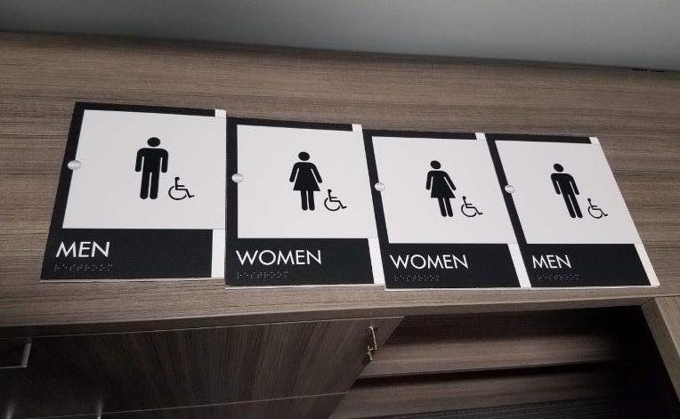
2. Contrast Dark and Light Colors
One of the biggest factors to consider with ADA signage is the color contrast you choose for your designs. Along with limiting glare, choosing colors that contrast each other can make it easy for people who can’t see well to differentiate letters.
The color choices themselves aren’t an issue. The main focus of ADA compliance should be light and dark contrast. For example, a very light turquoise could contrast against a dark navy on an interior sign to make it easy for people to differentiate the letters. However, if the colors are too close in tone, they might blur together. As you pull your brand colors for your signage, look for light and dark contrasting options to help your visually-impaired guests.
3. Choose Your Font and Width Accordingly
When developing ADA signage, your font choice, width, and spacing can affect how people see your message. The ADA recommends avoiding condensed or extended signage, instead using a moderate typeface with a medium weight. Signs that use script or overly-bold fonts can be difficult to read.
The font should also be a simple serif style or a sans-serif option. You can get creative with your font and use your own judgment, but consider the readability of the design you choose. How easy would it be for someone who is visually impaired to blend the letters together?
4. Add Signs Outside of Each Room
If you visit a hospital or commercial office park, you will notice that each room has a sign placed outside next to the door. The sign includes the room number and any relevant information (like the name of the person in that office or what the room contains). For example, a hospital might have a sign that says “Room 202 Storage,” which provides information as to what is inside.
These signs aren’t just for organization. They also help people with disabilities navigate your campus. Adding Braille to the signs allows blind visitors to know where they are, while the bold lettering guides the visually impaired to the right room.
If you are considering adding these room markers as part of your ADA signage, consider using our Clarity Interior Sign Program. You can streamline your sign design and get the right number of markers for each room you have.
5. Follow ADA Placement Guidelines
The ADA issued a series of best practices for where to place your door signage and other signs to guide blind visitors. They recommend placing the sign between 48-60 inches off the floor if someone is going to read it with Braille.
Make sure all of your signs are at the same height, so blind visitors can easily find them. Overhead signs should be placed at least 80 inches off the floor.
6. Identify Which Way Doors Swing
ADA compliance isn’t just about convenience, it’s also related to safety. One of the biggest safety features of ADA-accessible buildings is notices for whether a door swings out or pushes in. Not only will these notices (both visually written and in Braille) make it easy for visitors of all abilities to open doors, but they will protect them from getting hit by a fast-opening door if someone else walks through.
All doors that swing outward should have a sign mounted next to them. This alerts visitors to the importance of not standing too close.
7. Use Wayfinding to Guide Hearing Impaired Visitors
If you have a campus that has multiple buildings and rooms (such as a hospital), evaluate your wayfinding to see if it could be more clear. If you have a deaf or hard of hearing visitor, they might not want to ask for directions – or be able to. If you don’t have members of staff who speak sign language, that visitor might be left on their own to find their way.
Clear signs, frequently placed wayfinding signage, and detailed maps can help someone who can’t hear or isn’t sure how to ask for help. If these signs are large enough and use contrasting colors, they can also help your visually impaired guests as well.
Related: Hospital Wayfinding: 5 Navigation Problems and How to Solve Them
Use ADA Signs to Make Your Property More Inclusive
Make sure every person who walks onto your property feels welcome and safe. Use ADA signage to make your property accessible for everyone.
Follow the tips in this post to upgrade your signage. Or, get help with improving your new or existing signage by contacting Creative Sign Designs. Our signage experts are familiar with the best practices for using ADA signage and can help you ensure you hit every mark for accessibility.
If you want to make your signage more ADA-friendly, call Creative Sign Designs. We are happy to help you make a more accessible, inclusive campus.